table of contents
You manage vendors, but findings pile up. Remediation stalls. Stakeholders ask for proof that risks drop. A solid vendor risk dashboard cuts through the noise. It shows real progress on fixes.
These tools turn data into action. Risk teams spot overdue items fast. Executives see if programs work. In 2026, with cyber threats from third parties rising, clear dashboards build trust. They prove your efforts reduce exposure.
Let’s look at the metrics that matter most. Then see how to build views for your team.
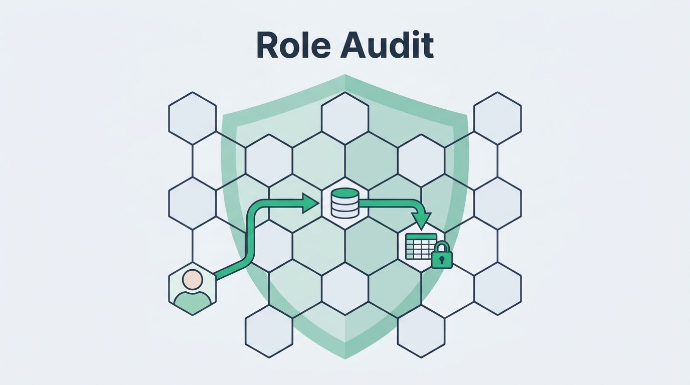
Why Focus on Remediation Progress in Vendor Risk Dashboards
Vendor risk starts with assessments. It ends with fixes. Dashboards shine here because they track the close-the-loop part. Most programs fail on follow-through. You assess vendors. You find gaps. But do they patch them?
Progress tracking fixes that. It shows open issues shrink over time. Teams assign owners. Deadlines hit or miss. Without visuals, reports bury details in spreadsheets. Dashboards make trends obvious at a glance.
Consider SLA attainment. Vendors promise fixes in 30 days for critical items. Your dashboard flags misses. This drives accountability. Risk drops as closures rise.
Executives need this view. They fund programs. They want risk scores down. Operational staff drill into details. Dashboards serve both. They pull from tools like assessment platforms or ticketing systems.
Best part? Automation feeds live data. No monthly exports. In cyber risk oversight, real-time views catch issues before breaches hit.
Key Metrics for Vendor Risk Remediation
Pick metrics that tie to outcomes. Focus on remediation speed and quality. Here are core ones.
Open findings by severity. Bars show critical, high, medium counts. Red for critical over 10. Yellow for high over 20. Green stays low. This metric spots portfolio hotspots.
Remediation SLA attainment. Pie chart breaks it: on-time, late, open. Target 90% for critical. Formula: (closures in SLA / total due) * 100. Low rates mean weak enforcement.
Overdue remediation rate. Gauge shows percentage past due. Alert if over 15%. It flags vendor delays or internal bottlenecks.
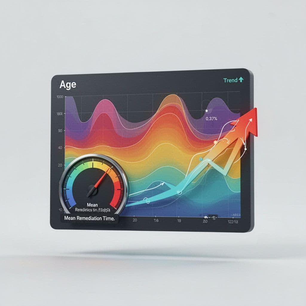
Mean time to remediate (MTTR). Average days from finding to close. Critical target: under 30 days. Calculate: sum(closure dates – open dates) / closed count. Trends matter more than snapshots.
Aging of findings. Buckets: 0-30 days, 31-60, 60+. Heatmap colors oldest red. This pushes prioritization.
For details on these and more, check Atlas Systems’ guide to third-party risk metrics.

This sample dashboard highlights open findings bars, closure trends line, and SLA pie. It keeps eyes on progress.
Add exception counts. Track approved risks. High numbers signal policy gaps. Recurring issue rates. Percentage of findings that reopen. Over 5%? Review vendors or processes. Closure trends. Line graph month-over-month. Upward slope proves success.
These KPIs work because they link actions to risk reduction. Set baselines from last year. Benchmark against peers where possible.
Tailor Dashboards for Executives, Managers, and Teams
One dashboard fits all? No. Customize views by role. This boosts adoption.
Executives want summaries. Gauges for overall overdue rate under 10%. Risk reduction trend over quarters. Portfolio score average dropping. They click for details but start high-level.
Risk managers need depth. Tables list top overdue by vendor. Filters for tier or category. MTTR by team owner. They own escalations.
Operational teams see tasks. My queue: assigned findings, due dates. Aging bars for their vendors. Recurring flags with history.
Split views make this easy. Tools let users toggle tabs.
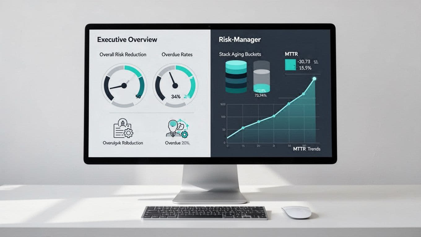
Here, left side suits leaders with gauges. Right aids managers with buckets and lines.
For examples, see VendorRisk’s dashboard tour. It prioritizes overdue alerts.
Role-based access prevents overload. Executives ignore task lists. Teams skip scores. Result? Everyone uses the tool.
Sample Dashboard Components and Visual Best Practices
Build with proven widgets. Keep them simple.
Heatmaps for aging. Color gradients: green 0-30 days, yellow 31-60, red 60+. Rows by vendor, columns by severity.
Gauges for MTTR. Speedometer style. Green under target, red over. Add trend arrow.
Trend lines for closures. Monthly bars stacked by severity. Line for cumulative closed.
Tables for exceptions. Columns: vendor, reason, approver, expiry. Sort by date.
These elements float to show aging heat, MTTR gauge, and trends.
Best practices: Limit to 5-7 widgets per view. Use consistent colors: red alert, green good. Add tooltips for formulas. Avoid 3D charts; they distort.
For KRI thresholds, review VendorFi’s metrics examples. Set alerts on breaches.
Export to PDF for boards. Mobile views for alerts.
Avoid Pitfalls in Vendor Risk Dashboard Design
Wrong metrics mislead. Busy-ness stats like assessments done don’t show risk drop. Track closures instead.
Vague targets hurt. “Low overdue” means nothing. Pick numbers: 10% max for critical.
Data staleness kills trust. Integrate live sources. Refresh every hour.
Overload views. Too many charts confuse. Test with users.
For remediation tips, see DSALTA’s vendor risk guide.
Fix these, and dashboards drive action.
Key Takeaways
Strong vendor risk dashboards focus on remediation KPIs like open findings, SLA hits, and MTTR. Tailor views to roles for buy-in. Use heatmaps, gauges, trends.
These tools prove programs work. Risks fall. Teams stay aligned.
Need help building yours? Book a Discovery Call with Bud Consulting. Start reducing vendor exposure today.