table of contents
Insider threats cost enterprises an average of $19.5 million each year. That’s up from last year’s $17.4 million. Most incidents, about 55%, stem from accidents like careless data sharing.
You run a SOC or manage insider risk. You need clear visibility into detection performance. Dashboards turn raw alerts into actionable insights.
These tools help you spot trends, justify budgets, and prove program value. Let’s break down the metrics and designs that work.
Why Track Detection Rates in Insider Threat Dashboards
Detection rates show if your insider threat program catches risks early. Firms face 13.5 incidents yearly. Without solid tracking, you miss weak spots.
Start with program goals. Do you aim to cut mean time to detect? Or reduce false positives that waste analyst time? Dashboards align metrics to these priorities.
Consider compliance too. Regulations like GDPR or NIST demand proof of risk monitoring. A good dashboard logs detection coverage across channels, from email to cloud storage.
Program maturity matters. New teams focus on basic alert volumes. Mature ones track escalation rates and ROI, like avoided losses of $8.2 million annually from strong programs.
Use dashboards to benchmark. Compare true positives quarter over quarter. If rates stall, tweak rules or train staff.
Remote work amps risks; 75% of experts flag hybrid setups. Dashboards reveal if home users trigger more alerts.
Tie metrics to business impact. Show executives how better detection saves money. This builds support for tools and headcount.
Key Metrics to Track Detection Performance
Focus on a core set of metrics. True positives measure confirmed threats caught. False positives flag noise that buries real signals.
Mean time to detect (MTTD) tracks hours from risky behavior to alert. Aim below 67 days, per recent benchmarks.
Alert-to-investigation rate shows efficiency. If only 20% of alerts lead to probes, refine your rules.
Case escalation rate reveals severity. How many investigations become HR or legal cases?

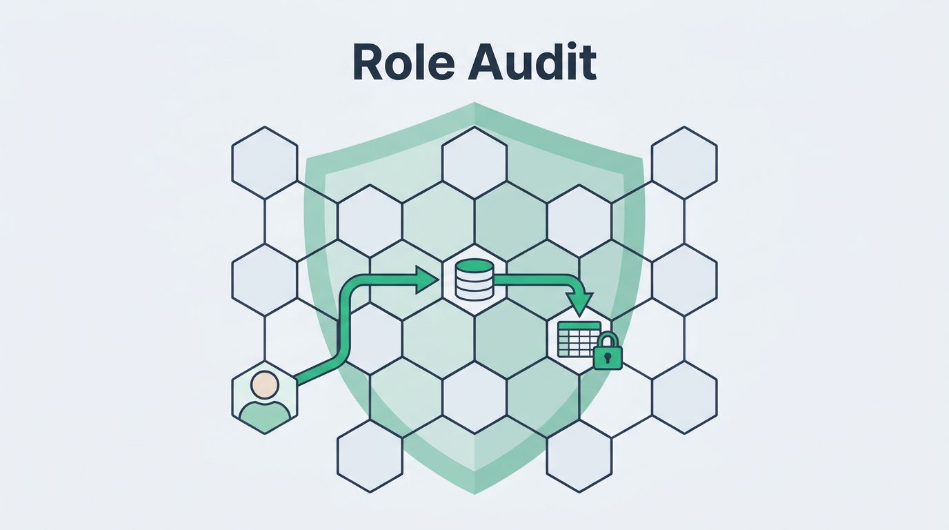
Detection coverage by channel breaks down email, USB, or SaaS apps. Risk scenarios, like data exfiltration, need separate views.
| Metric | What It Tracks | Target Benchmark |
|---|---|---|
| True Positives | Confirmed threats | >80% of alerts |
| False Positives | Invalid alerts | <15% |
| MTTD | Time to alert | <24 hours |
| Alert-to-Investigation | Probes started | 25-40% |
| Case Escalation | Severe cases | <10% |
This table summarizes essentials. After reviewing, adjust thresholds based on your data.
Proofpoint outlines similar insider threat metrics to justify programs. They stress legal costs and avoidance.
Layer in trends. Weekly line charts beat static numbers. Spot if shadow AI use spikes false positives.
Designing Dashboards That Align with Business Goals
Match dashboard design to objectives. Security leaders want high-level trends. Analysts need drill-downs.
Start with objectives. For compliance, add coverage gaps. For maturity, include MTTR and throughput.
Prioritize views. Top row: detection rates by scenario. Middle: user risk scores. Bottom: efficiency KPIs.
Use filters for departments or time periods. This lets directors focus on finance teams.

Build in interactivity. Click a bar for user details. This speeds triage.
Align with maturity models. The NITTF framework calls for metrics tied to goals and annual reports.
Compliance needs audit logs. Export CSV for regulators.
Test with users. SOC analysts flag cluttered layouts. Iterate based on feedback.
Automate updates. Real-time feeds from SIEM or UEBA tools keep data fresh.
For ROI, add cost projections. Show $4.9 million saved per malicious incident avoided.
Real-World Examples of Effective Dashboards
Microsoft’s Insider Risk Management users dashboard lists risky users with alert history and risk scores. It filters active policies for quick scans.
Netskope’s insider threat dashboard ranks top risky users via analytics. Videos demo tuning for your environment.
Proofpoint’s user risk view prioritizes by policy violations. Trends over time highlight rising threats.

A financial firm dashboard used heat maps for channel coverage. Red zones showed weak USB monitoring; they fixed it in weeks.
Healthcare example: Pie charts tracked escalations. 30% rate dropped to 12% after rule tweaks.
InsiderRisk.io suggests visibility dashboards with risk trends and violation summaries.
These setups balance overview and detail. Customize for your stack, like Splunk or Elastic.
Common Mistakes and Fixes in Dashboard Builds
Don’t fixate on one metric, like raw detection rates. It ignores false positives that burn out teams.
Overload screens. Limit to 6-8 visuals per page. Use tabs for depth.
Ignore baselines. Compare to industry averages, like 76% reporting rising incidents.
Static charts mislead. Always add time series.
Poor mobile support frustrates on-call staff. Ensure responsive design.
Skip context. Pair numbers with explanations, like “False positives rose due to new AI tools.”
Neglect access controls. Execs see summaries; analysts get raw data.
Fix by piloting small. Gather feedback quarterly.
Key Takeaways
Strong insider threat dashboards track true positives, MTTD, and coverage gaps. They align metrics to goals and cut costs.
You now have practical steps: pick core KPIs, design for users, learn from examples, dodge pitfalls.
Build yours to match maturity. Programs with these tools avoid 7 incidents yearly and save millions.
Book a Discovery Call with Bud Consulting if you need help implementing.
(Word count: 1487)