table of contents
You run a SOC that drowns in alerts every day. Tools fire off notifications non-stop. Yet breaches still slip through. The issue? Most teams chase raw numbers instead of outcomes.
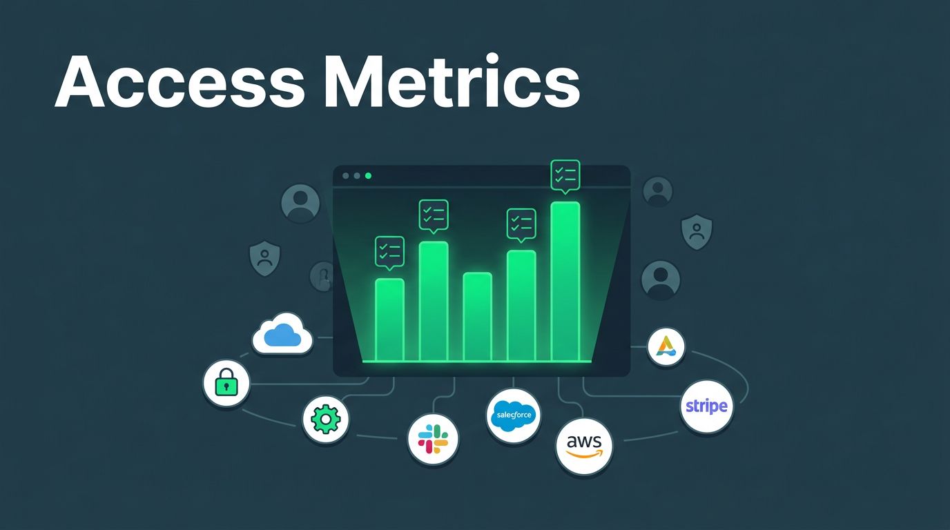
Security metrics dashboards fix this. They shift focus from alert volume to actual risk reduction and response speed. You get clear views of tool performance and team efficiency. This helps justify budgets and spot weak spots.
Let’s break down how to build dashboards that drive decisions.
Why SOC Teams Need Better Metrics
Security tools promise protection. But without solid metrics, you can’t prove they deliver. Dashboards turn data into actionable insights. They show if your EDR catches threats fast or if your SIEM overwhelms analysts with noise.
Consider dwell time. Attackers linger longer when detection lags. Track it, and you see tool gaps. Or look at false positive rates. High numbers burn out your team. Dashboards reveal patterns over weeks, not just daily spikes.
Teams often stick to basic counts. Alerts handled per analyst sounds good. But it ignores quality. Did those alerts matter? Effective dashboards measure resolution rates and threat coverage instead.
In 2026, boards demand proof of ROI. Dashboards link security spend to business risk. For example, Microsoft Sentinel’s incident metrics let SOC managers chart MTTR trends by severity. This builds trust with executives.
You avoid guesswork. Baselines from past quarters set targets. Trends guide tweaks, like tuning rules to cut noise. Result? Faster responses and fewer surprises.
Key Metrics to Track for Tool Effectiveness
Pick metrics tied to outcomes. Start with detection and response times. Mean time to detect (MTTD) shows how quick tools spot issues. Mean time to respond (MTTR) measures containment speed. Aim for under four hours on critical alerts.
Next, coverage rates. What percent of assets do tools monitor? Track detection coverage by threat type, like ransomware or phishing. Pair it with risk scores from vulnerability scanners.
Triage efficiency matters too. False positive ratio flags noisy tools. Resolution rate tracks closed incidents per day. Add threat exposure scores. They weigh likelihood against impact.
For operational health, monitor backlog age. Old tickets signal overload. Analyst utilization shows workload balance. All these feed into dashboards.
ArmorPoint outlines top SOC KPIs, like alert severity breakdowns and resolution notes. Use them as a starting point. Customize to your stack, say SIEM plus XDR.
Set thresholds. Green for MTTR under target, yellow for warnings. This makes scans quick. Review weekly to adjust.
Designing Dashboards That Work
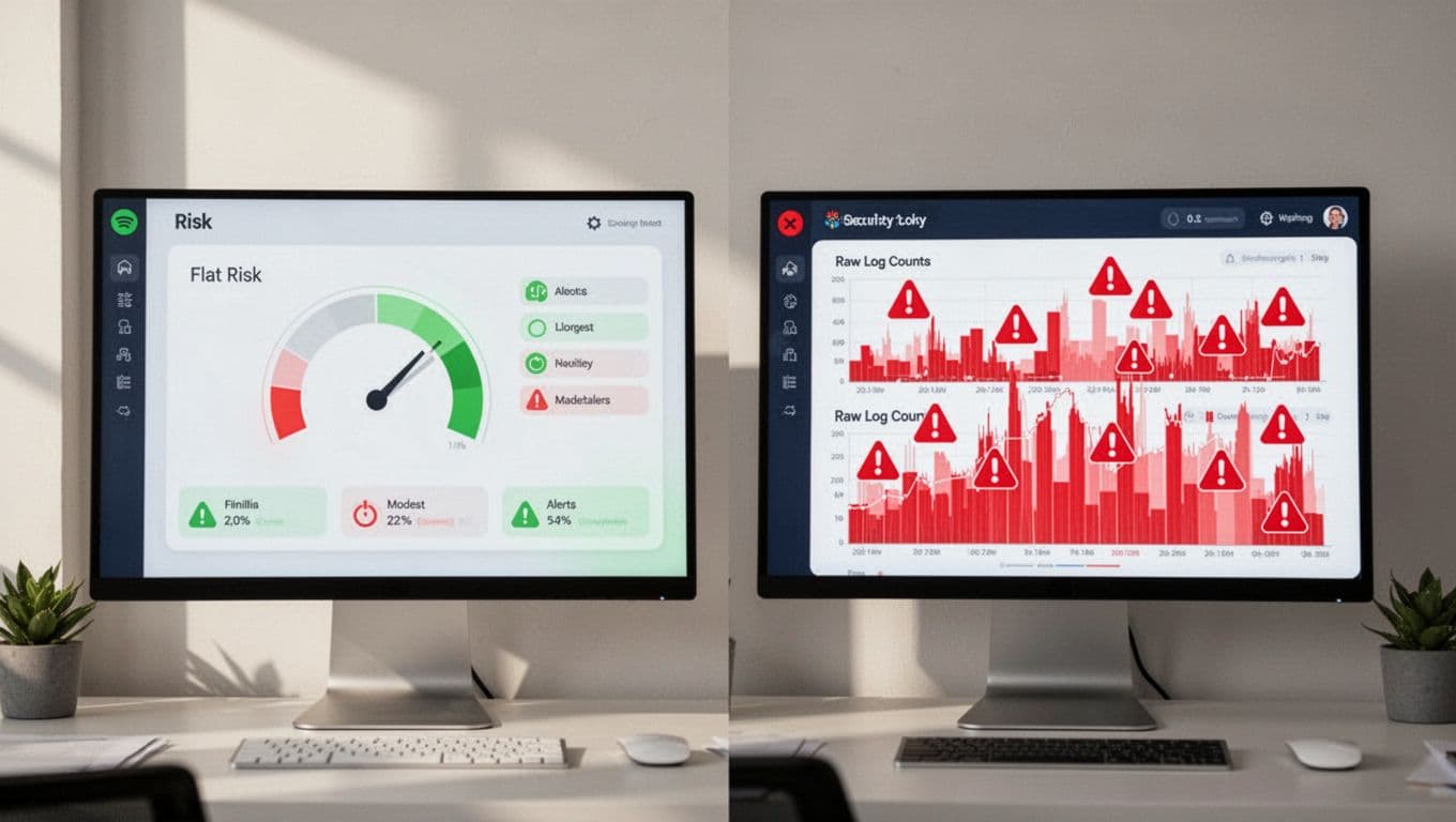
Layout drives usability. Put high-impact metrics front and center. Top row: real-time MTTD/MTTR gauges. Middle: trend lines for risk scores. Bottom: heat maps for coverage gaps.
Choose tools like Grafana or Splunk. They pull from multiple sources. Filter by time, team, or tool. Mobile views help on-call staff.

Group by category. One panel for threats: pie charts of types. Another for ops: bar graphs of triage times. Use consistent colors. Green for good, red for alerts.
SecPortal’s guide suggests six categories: ops, risk, exposure, insider threats, compliance, finance. Build panels around these.
Test with users. Analysts need drill-downs. Execs want summaries. Add tooltips for context. Refresh every five minutes for live data.
Keep it simple. Too many charts confuse. Limit to 10-12 key visuals per view.
Common Pitfalls to Avoid in Metrics
Vanity metrics kill progress. Alert volume looks impressive. But more alerts often mean poor tuning, not better security. Focus on threats stopped, not logs processed.
No baselines mislead. Trends without history lack context. Establish six-month norms first.
Disconnected tools fragment views. SIEM data ignores endpoint metrics. Integrate via APIs for full pictures.
The NCSC warns against ticket-focused metrics. They distract from detection quality. Goodhart’s Law applies here too: optimize one number, and it loses meaning.
Skip business context at your peril. Metrics must tie to revenue risks or compliance fines. Annotate spikes with events, like patch Tuesdays.
Fix these. Audit quarterly. Pair activity metrics with outcomes. Balance keeps teams honest.
Aligning Dashboards to Security Goals
Tie metrics to objectives. Risk reduction? Track score drops post-tool rollout. Ops efficiency? Monitor MTTR before and after automation.
For investments, compare tools. Dashboard shows EDR A cuts dwell time 30% over B. Boards see value.
Sample sections work well. Threat panel: exposure trends. Ops: backlog and utilization. Risk: critical vuln density.
Involve stakeholders. CISOs set priorities. Analysts pick visuals. This ensures buy-in.
Use for continuous improvement. Monthly reviews spot drifts. Adjust rules or staffing based on data.
Dashboards support culture too. Share wins, like faster responses. It motivates teams.
If gaps persist in skills or strategy, book a discovery call with Bud Consulting. They help source talent and refine ops.
Key Takeaways
Dashboards reveal true tool value beyond noise. Track MTTD, coverage, and risk trends to guide actions.
Build simple, integrated views. Avoid vanity traps. Align to business risks for impact.
Your SOC thrives on these insights. Start with baselines today. Watch effectiveness grow.