table of contents
Phishing attacks send 3.4 billion malicious emails daily as of early 2026. You know the stakes. One click can lead to ransomware or data theft. Yet many teams struggle to prove their defenses work.
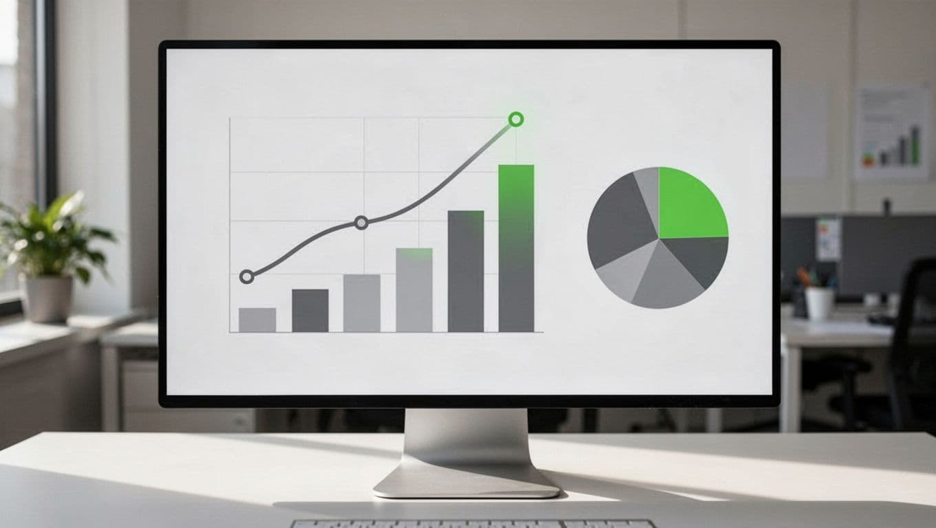
A solid phishing metrics dashboard changes that. It turns raw data into clear signals on awareness training and email filters. You spot weaknesses fast and show progress to leaders.
This guide breaks down the metrics that matter. You’ll get formulas, examples, and tips to build dashboards that guide action.
Why Track Phishing Metrics in Dashboards
Dashboards pull together data from simulations, real attacks, and training logs. They help you answer key questions. Is training sticking? Do filters catch most threats?
Consider this. Without metrics, you chase shadows. Teams react to incidents instead of preventing them. Dashboards shift focus to prevention.
Start with baselines from industry reports. KnowBe4’s 2025 Phishing by Industry Benchmarking Report shows untrained users have a 33.1% phish-prone percentage. That drops to 4.1% after a year of training. Use these to gauge your position.
Build dashboards in tools like Tableau or Power BI. Pull data from your phishing platform. Refresh daily for operational views, weekly for execs.
Frequency matters. Review operational metrics daily or weekly. Share executive summaries monthly. This keeps teams agile and leaders informed.
Key Metrics for Phishing Awareness Programs
Awareness metrics focus on human behavior. They measure how employees respond to simulated attacks.
Top metric: phishing simulation click rate. Formula: (clicks / delivered simulations) x 100. Aim below 10%. Industry average hovers at 14-33% pre-training, per Hoxhunt data.
Next, report rate. Formula: (reports / delivered simulations) x 100. Good programs hit 50-70%. It shows users spot and flag threats.
Track time to report. Average under 60 seconds beats the untrained 21-second click time from recent stats.
Repeat offender rate flags chronic issues. Formula: (unique users clicking twice+ / total clickers) x 100. Keep it under 20%.
For benchmarks, check Proofpoint’s CISO Dashboard. It compares your rates to peers.
These metrics tie training to outcomes. Segment by department. Sales teams often click more due to urgency lures.
Metrics for Technical Email Security Controls
Technical metrics track filters and gateways. They differ from awareness ones. Here, success means threats never reach inboxes.
Detection rate leads. Formula: (phishing emails blocked / total phishing emails) x 100. Target 99%+. AI phishing bypasses filters in 56% of cases now.
False positive rate. Formula: (legit emails quarantined / total quarantined) x 100. Stay under 0.1% to avoid user frustration.
Mean time to detect (MTTD). Formula: average seconds from delivery to block. Under 10 seconds works well.
Phishing volume blocked daily shows scale. Pair it with BEC detections. Those cost $3 billion in the US last year.
See Cloud Security Alliance’s 7 Email Security Metrics for more on report and click rates in context.
Combine these with awareness data. Filters catch most, but humans flag the rest.
Executive vs Operational Dashboards
Executives need high-level views. Operations demand details.
Executive dashboard: Overall risk score. Formula: weighted average of click rate (40%), report rate (30%), detection rate (30%). Show trends over quarters.
Phish-prone percentage from simulations. Benchmark against 4.1% trained average.
Operational dashboard: Daily alerts, top user offenders, scenario breakdowns.
Use one screen for execs: green for on-track, red for risks. Ops gets drill-downs.
Tailor access. CISOs see summaries; SOC teams get raw feeds.
Interpreting Trends in Your Phishing Metrics
Trends reveal if efforts pay off. A flat click rate means tweak simulations.
Look for declines. Strong programs drop clicks 8-15 points yearly, per PhishSkill benchmarks.
Rising reports signal behavior change. Correlate with training completion (90%+ in finance).
Watch spikes. A sudden jump might tie to new AI lures.
Formula for improvement velocity: (prior period rate – current rate) / prior rate. Positive values guide next steps.
Segment trends by user group. New hires improve fastest.
Pitfalls: Vanity Metrics to Avoid
Skip total training completions. High rates (90-98% in regulated sectors) don’t prove behavior change.
Global averages hide issues. Break out by scenario: urgency clicks stay high.
Ignore unverified reports. Count only confirmed phish flags.
Smartfense outlines what matters: repeat offenders, report times.
Vanity distracts. Focus on risk reducers like dwell time.
Review Cadence and Reporting Best Practices
Daily: Check detections and alerts.
Weekly: Awareness simulation results.
Monthly: Executive reports with benchmarks.
Quarterly: Deep dives, like SANS tiering model.
Automate alerts for thresholds. Click rate over 15%? Trigger review.
Share via email or Slack. Include one action item per report.
If building this feels overwhelming, Book a Discovery Call with Bud Consulting. They help teams measure human risk effectively.
Key Takeaways
Strong phishing metrics dashboards blend awareness and technical data. They highlight trends that cut real risk, like dropping clicks below 5%.
You now have the metrics, formulas, and cadences to start. Pick three to track first.
Build yours today. Your next report will show progress that matters.