table of contents
Executives glance at your security dashboard for seconds. They want to know if risks threaten revenue or operations. A jumble of alerts confuses them.
You face this often. Security teams drown in data, but leaders need simple views of threats to the business. Good dashboards translate tech details into risk trends and progress updates. They spark decisions, not debates.
This guide shows you how. Start by understanding their priorities, then pick the right metrics.
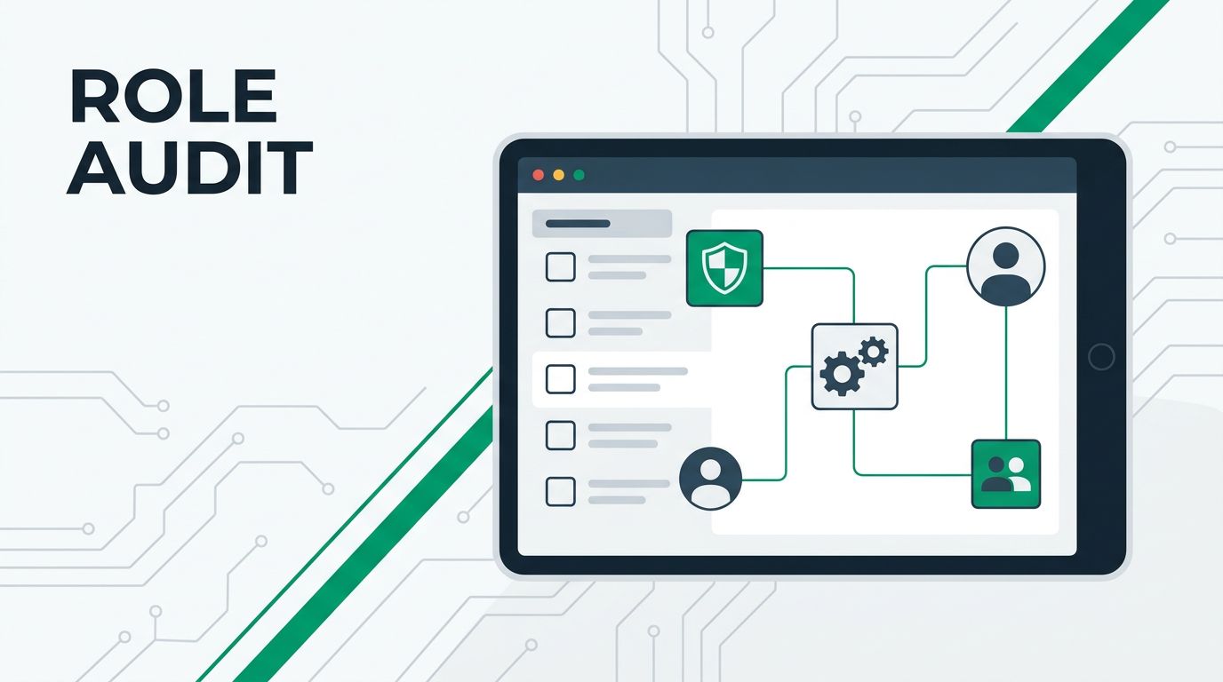
Know What Nontechnical Leaders Care About
Board members and department heads focus on business impact. They ask if security protects customers and meets regulations. Forget tool-specific stats; show how threats affect sales or compliance fines.
In 2026, transparency rules executive reporting. Leaders expect clear views of program health. They want trends over time, not snapshots. For example, a rising phishing success rate signals staff training gaps that hit productivity.
Risk exposure tops their list. Tie it to dollars: potential breach costs or downtime. Remediation progress matters too. Show open high-risk issues dropping each month.

This image captures a typical board review. Notice the relaxed discussion around a projected dashboard. Green highlights draw eyes to positive trends.
Control coverage reassures them. Display percentage of critical assets protected. SLA performance tracks response times against promises. Compliance status uses simple gauges: green for on track.
Tailor to your audience. Sales VPs care about customer data risks. Finance leaders watch audit readiness. Ask what keeps them up at night, then build around that.
Pick Metrics That Matter to Business
Raw alert counts mislead. One day spikes from a false positive frenzy; the next drops to zero. Leaders see chaos, not control.
Choose trends instead. Incident volume over six months reveals patterns. A steady decline proves your fixes work.
Business risk exposure works well. Score vulnerabilities by exploit likelihood and impact. Graph the top 10 by potential loss. Watch that score fall as you patch.

These charts focus on what executives grasp fast. The line trends down for incidents. Gauges and bars highlight progress.
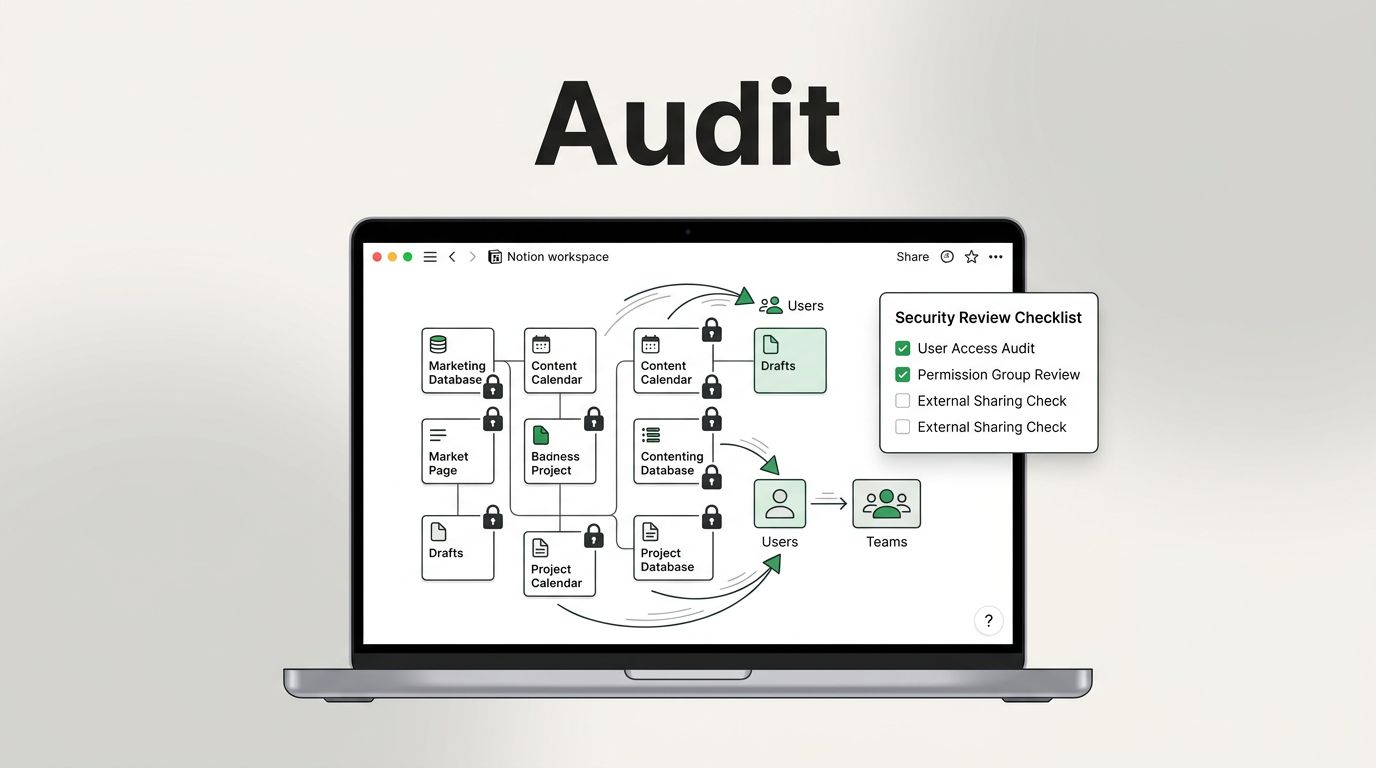
Remediation progress tracks mean time to fix. Break it into high, medium, low risks. Compliance status shows pass rates for key frameworks like GDPR or SOC 2.
SLA performance measures detection and response speeds. Compare against targets. Control coverage percentages confirm defenses in place.
Avoid tool metrics without context. Endpoint detection rates mean little alone. Pair them with breach attempts blocked.
Test metrics with a nontech colleague. If they nod and ask smart questions, you win.
Spot the Difference: Good Dashboards vs Bad Ones
Clutter kills comprehension. Bad dashboards cram 20 charts, red icons everywhere, tiny fonts. Viewers tune out.
Good ones breathe. Limit to 4-6 visuals. Use white space. Bold trends with color.
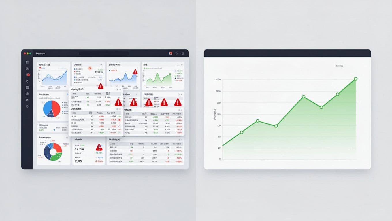
The left screen overwhelms with overlap and alerts. The right invites review with space and focus.
Bad example: A table of 500 alerts by type. Leaders skip it.
Good swap: A pie chart of incidents by department. Add a trend line. Now they see HR’s phishing issues and decide on training.
Skip 3D charts or gradients. They distract. Use lines for trends, bars for comparisons, gauges for status.
Mobile matters. Executives check phones. Ensure responsive design scales down clean.
Add context notes. “Risk score down 15% since Q1 fixes.” No jargon.
Checklist for Effective Security Dashboards
Use this quick review list before sharing. It keeps dashboards sharp.
These icons match checklist items.
- Trends over snapshots: Does every metric show change over time? Static numbers bore.
- Business tie-ins: Link stats to revenue, ops, or regs? Pure tech fails.
- Top 3-5 only: Limit views. Drill-down for details.
- At-a-glance status: Green, yellow, red? Add one-word summaries.
- Action prompts: Next to risks, suggest steps like “Patch by EOW.”
Run the checklist monthly. Update based on feedback.
Tools like Tableau or Power BI help. Start simple in Google Sheets for prototypes.
If building takes time, Book a Discovery Call with Bud Consulting. They guide security leaders on reporting.
Key Takeaways
Security dashboards succeed when they speak business. Focus on trends, risks, and progress. Ditch clutter for clarity.
Nontechnical stakeholders decide budgets. Clear views build trust and get buy-in.
Apply these steps now. Your next board meeting runs smoother. Leaders grasp status fast and back your plans.