table of contents
You manage AppSec in a world where code deploys fast, but vulnerabilities follow close behind. Teams push releases daily, yet breaches from unpatched flaws still hit headlines. Poor visibility into your security risks leaves you guessing on priorities.
Application security metrics fix that. They turn raw scan data into clear signals for action. You spot trends, assign fixes, and prove value to leaders.
This post shows you how to build dashboards that drive decisions. Start with core metrics, then tailor views and integrate tools.
Why Application Security Metrics Drive Better Decisions
Metrics give your AppSec program focus. Without them, you chase alerts in silos. Data from scans piles up, but no one knows what matters most.
Consider remediation speed. If high-severity issues linger over 30 days, attackers gain time. Dashboards highlight these gaps right away. You assign tickets faster, and fixes happen sooner.
Teams also need proof of progress. Raw vulnerability counts mislead because tools flag duplicates or old issues. Instead, track mean time to remediate (MTTR). This metric ties security to dev velocity.
In 2026, CISOs demand outcomes. Dashboards link metrics to risk reduction, like fewer exploitable flaws in production. They help you justify budgets too.
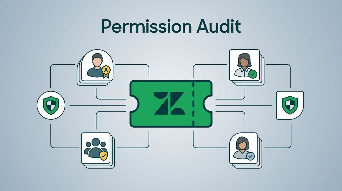
For real-world examples, check GitLab’s security dashboards. They aggregate scanner data into group-level views.
Key Application Security Metrics to Track
Focus on metrics that reflect posture, not just activity. Vanity metrics like total scans run impress no one. They ignore if flaws persist.
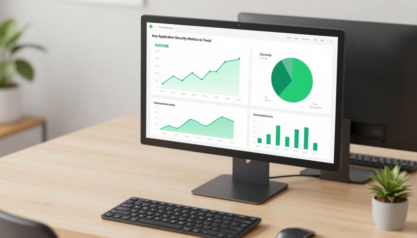
Start with open vulnerabilities by severity. Break it down: critical, high, medium. A pie chart shows distribution at a glance. If criticals dominate, prioritize those apps.
Next, track MTTR. Calculate days from detection to fix. Aim for under 14 days on highs. Bar graphs compare teams or apps.
Coverage matters too. What percent of repos run SAST weekly? Low numbers mean blind spots. Line charts over time reveal improvements.
Risk scores consolidate data. Weight flaws by exploitability, not just CVSS. Tools like those in Mend’s platform offer this view.
Add secrets exposure rate. How many repos hide API keys? Trend it monthly. Dips show training works.
These picks support decisions. They flag risks early and measure fixes.
Tailor Dashboards for Different Stakeholders
One dashboard fits no one. Executives want risk summaries. Engineers need issue lists. Customize views to match roles.
For CISOs, show a single risk score. Use gauges for overall posture. Tie it to business impact, like revenue apps at risk. They scan in seconds.
AppSec managers get velocity metrics. Charts on MTTR trends and backlog age help them allocate resources. Filter by pipeline stage.
Dev teams see open issues assigned to them. Lists with severity and repro steps cut triage time. Add remediation guidance.

Segment by environment too. Prod views stress runtime flaws from DAST. Dev focuses on SCA reachability.
This approach boosts adoption. Stakeholders engage because data speaks their language. As a result, remediation accelerates across teams.
Integrate Data from Modern AppSec Tools
Siloed tools create blind spots. Pull SAST, DAST, SCA, IaC scans, secrets detection, and API findings into one ASPM dashboard.
Start with APIs. Use webhooks or agents to feed results. Normalize severity scales first. Critical in SAST might differ from DAST.
Centralize in ASPM platforms. They dedupe alerts and score risk. Coverage metrics emerge: 95% of repos scanned?

For example, Snyk outlines KPIs like patch rates from SCA. Combine with runtime data for full posture.
Handle data quality issues. False positives skew views, so track fix rates per tool. Low ones signal tuning needs.
Automation shines here. Alerts trigger on thresholds, like MTTR spikes. Teams respond before risks grow.
Balance Trends, Snapshots, and Risk Outcomes
Trends show progress, but snapshots reveal current state. Mix both for balance.
Line charts track MTTR over quarters. Drops prove efficiency gains. However, a current backlog snapshot warns of overload.
Point-in-time metrics include pass rates on gates. What percent of PRs block on high flaws? High numbers protect prod.
Map to outcomes. Link metrics to risk reduction: flaws fixed before deploy cut prod escapes by 40%. Coverage ties to fewer unknowns.
Stakeholders love this. Execs see ROI. Teams get actionable feedback.
Avoid overload. Pick 5-7 core metrics per view. Refresh daily for dev, weekly for execs.
Tools like Contrast’s dashboard blend these well. They graph ATTR trends with current scores.
Spot Vanity Metrics and Focus on What Counts
Total vulnerabilities impress until you see most are noise. Vanity metrics distract from real risks.
Scan volume looks good but ignores outcomes. A team scans everything yet ships flaws. Measure fixes instead.
Developer training hours? Nice, but tie it to behavior. Track secure code commits post-training.
Use Palo Alto’s ASPM metrics guide for pointers. They stress MTTR and pass rates over counts.
Operational metrics help too. Percent of apps with IaC scans? Gaps show infra risks.
Stick to risk-based picks. They guide priorities and build trust.
Conclusion
Strong metrics dashboards clarify your AppSec posture. Track MTTR, coverage, and risk scores. Tailor views, integrate tools, and balance data types.
You gain faster fixes, better coverage, and proven risk drops. Teams align because everyone sees relevant signals.
Build yours now. If gaps persist, book a discovery call with Bud Consulting to strengthen your program. Your posture improves from there.