table of contents
Your IR team handles high-stakes alerts every day. But without clear visibility into their performance, bottlenecks hide, and improvements stall. You end up guessing what’s working and what’s not.
IR team dashboards fix that. They turn raw data into actionable insights on response times, workloads, and outcomes. This lets you spot issues fast and make smart decisions on staffing or processes.
Let’s start with why these dashboards matter for your operations.
Why Your IR Team Needs Dashboards
Dashboards give your team a real-time pulse on efficiency. They show if alerts turn into incidents too slowly or if resolutions drag on. Without them, you rely on gut feel or monthly reports that miss the action.
Consider a SOC where analysts juggle 200 alerts daily. One dashboard reveals 40% false positives eating time. You cut that noise, and response speeds up. That’s the power.

These tools also support tough calls like hiring. High escalation rates signal understaffing. Low SLA adherence points to training gaps. For instance, Grafana’s incident insights track MTTD and MTTR to highlight patterns.
Dashboards foster continuous improvement. Teams review trends weekly. Managers adjust shifts based on peak incident times. Executives see ROI on tools. Result? Faster responses and fewer breaches.
You build trust with leadership too. Clear visuals prove your team’s value. No more vague updates in meetings.
Key Metrics to Track
Focus on metrics that reveal true efficiency. Start with core times: MTTD (mean time to detect), MTTA (mean time to acknowledge), MTTC (mean time to contain), and MTTR (mean time to resolve). These show speed from alert to fix.
Track alert-to-incident conversion rates next. A high rate means good triage; low suggests overload. Escalation rates flag handoffs that slow things down.
Case volume by severity helps prioritize. High volume in critical cases demands attention. SLA adherence tracks if you meet response promises. Analyst workload balances tickets per person; spikes predict burnout.
Don’t skip false positive rates or repeat incidents. High falses waste time. Repeats mean weak remediation. Post-incident remediation completion ensures lessons stick.
Rootly’s default metrics cover incident volume and response times well. Pair these with your data sources for baselines. Set targets, like MTTR under 4 hours for high-severity cases. Review monthly to refine.
These metrics guide decisions. Slow MTTD? Tune detection rules. High escalations? Train juniors better.
Tailor Dashboards to Roles
One dashboard doesn’t fit all. Customize views for executives, managers, and analysts. This keeps everyone focused without overload.
Executives need high-level KPIs. Show aggregate MTTR, SLA compliance, and total incidents reduced over quarters. Use simple gauges and trend lines. They care about risk and budget impact.
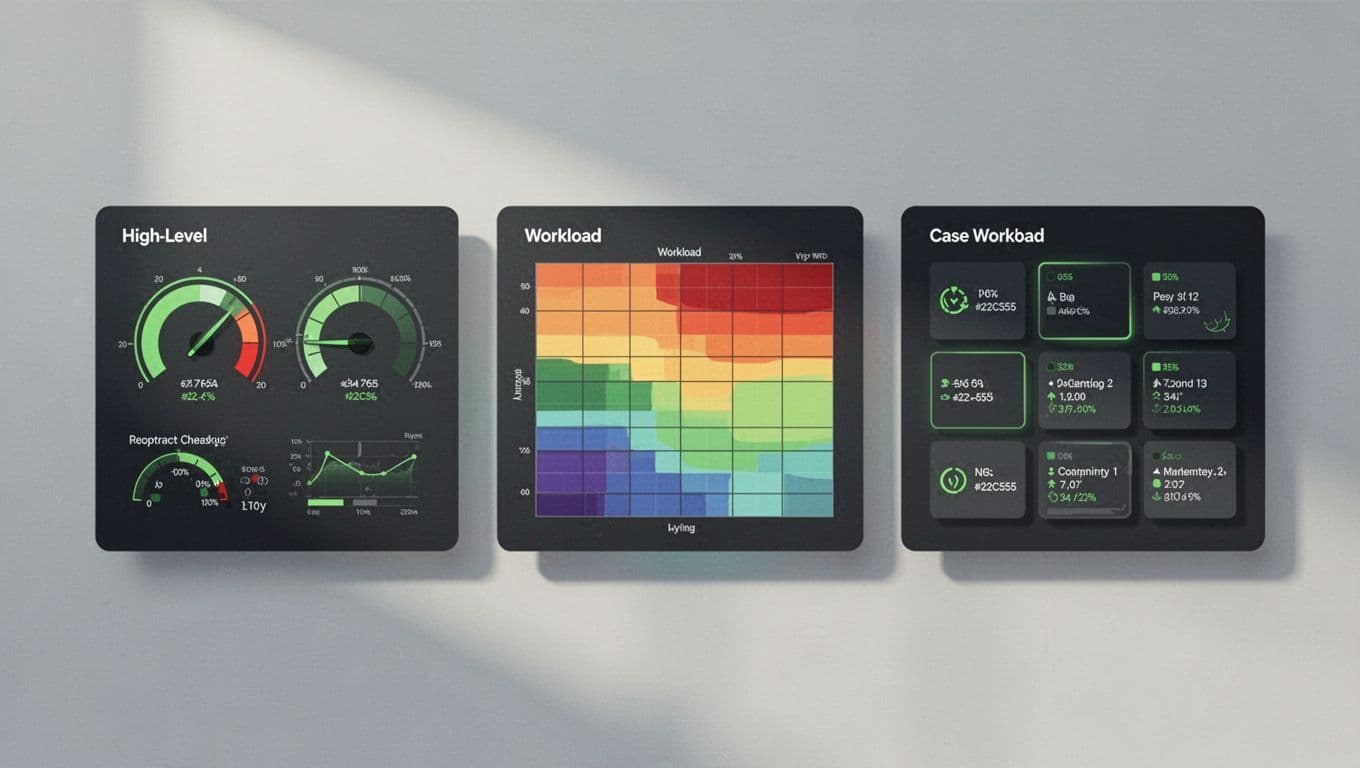
Managers drill into operations. Display analyst workloads, escalation rates, and case volumes by severity. Heat maps spot bottlenecks. They use this for shift planning and training.
Analysts get tactical details. Current open cases, false positive alerts, and personal MTTR. Quick filters for their queue help them close tickets faster.
Microsoft Sentinel’s SOC metrics workbook offers role-based views like this. Filter by user role in your tool. Test with your team; tweak based on feedback.
Tailored dashboards cut confusion. Executives grasp strategy fast. Frontline stays productive.
Choose the Right Visualizations
Pick charts that match your data. Bar charts compare MTTR by incident type. Line graphs track alert volume over time. Pie charts show severity splits, but use them sparingly to avoid misreads.
Heat maps work for workloads; they highlight peak hours. Gauges suit SLA percentages. Stacked bars reveal escalation paths.
Avoid pitfalls. Don’t cram too many charts; limit to 6-8 per view. Use consistent scales to prevent false alarms. Color code severity: red for critical, green for resolved.
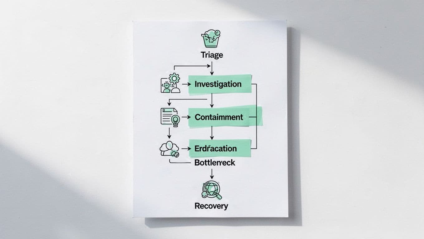
For processes, flowcharts map triage to recovery. They pinpoint stalls, like long investigations.
BigPanda’s guide to IR KPIs suggests these for clear trends. Update dashboards daily. Add drill-downs for context.
Right visuals make data intuitive. Your team acts quicker.
Implement Dashboards for Lasting Gains
Start small. Pull data from your SIEM or ticketing system. Tools like Grafana or Splunk handle integrations.
Set up alerts for thresholds, say MTTR over target. Share via Slack or email for managers.
Train your team. Show analysts how to read their views. Run quarterly reviews to add metrics like repeat incidents.
Watch for overload. If dashboards slow decisions, simplify. Benchmark against peers; ArmorPoint’s SOC KPIs list solid starts.
Link to staffing. Heavy workloads? Book a Discovery Call with Bud Consulting for talent advice. They vet IR experts fast.
These steps turn dashboards into tools for growth.
Key Takeaways
IR team dashboards reveal what’s slowing your responses and where to improve. Track essentials like MTTD, MTTR, and workloads. Customize by role, pick smart visuals, and review often.
You now have a blueprint to build yours. Teams with these see faster resolutions and happier analysts. Start today; your next incident depends on it.